Origins of the Potography Colorleaf
As we begin our third year of photo contests, we wanted to share some history celebrating the evolution of our brand and our brand identity over the years.
Read on to learn more about the origins of the Potography Colorleaf, along with why we’re making some minor but important changes to our classic logo moving forward.
The Backstory
For those who don’t know the backstory, the Potography logo was originally designed by @carolinerosemuzak ’s dad, Phil Rose, or, as I know him, Uncle Phil.
Uncle Phil’s original logo (below) was exactly the same as the current logo with the exception of the leaf. Uncle Phil’s logo had a traditional serrated cannabis leaf with a stem included, while the updated leaf has smooth edges and no stem.
The coolest part about Uncle Phil’s original design is how the first four letters, “POTo,” are outlined and shaped to trick your eye into seeing a camera, and the remaining group of letters, “graphy,” resembles a strap (or film, depending on who you ask).
This is the work of an artistic genius!
Still, I had a vision in my mind for something a bit more colorful, something that screamed “art” and “photography” just a little bit louder.
I didn’t know anything about color theory or design, so coming up with a combination of colors to use in the logo was a bit overwhelming.
Even though I grew up surrounded by artists, from Uncle Phil and Caroline to my brother Will who kills it on the drums, I never considered myself “creative.” I was actually one of those people who would tell others “I’m not creative.” These days, I feel like saying “I’m not creative” is the same as saying “I’m not a human.”
That’s why I eventually landed on the rainbow colors. Rainbows were always a safe default for me. I didn’t have to choose a favorite color combination. Rainbows are tried and true.
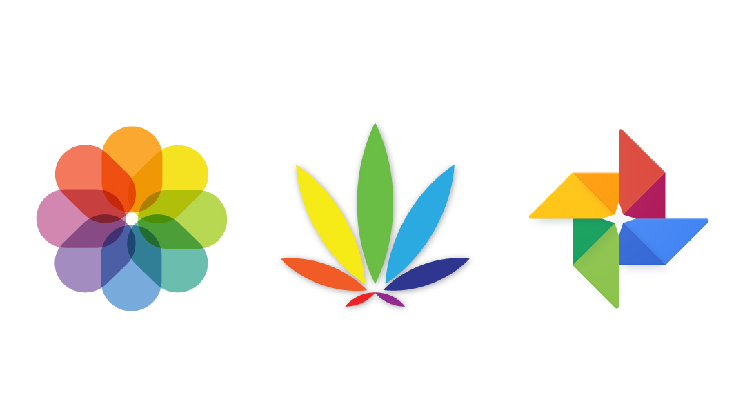
Along with my indecision, the rainbow color scheme seemed like a good fit for Potography since the Apple Photos and Google Photos app icons both made prominent use of the rainbow colors, and I saw the “rainbow leaf” as a spin on this.
The Colorleaf Origin Story
Fast forward a decade or so later to 2018 or early 2019, and I now have the original logo from Uncle Phil and a vision for the “rainbow leaf” stuck in my head.
I knew I needed to learn how to design greeting cards so I could print them on hemp paper (my first hemp printing project in what would eventually become Custom Hemp Solutions). So, I downloaded Adobe Illustrator and started teaching myself the basics of graphic design.
After lots of trial and error, I finally found myself with a handful of finished variations of what I dubbed the “Colorleaf.”
The final step was to cut out the original serrated leaf from Uncle Phil’s logo and replace it with each variation of the new Colorleaf symbol until I settled on the one that complimented Uncle Phil’s original design the best.
And that’s how the Potography logo, as the world knows it today, was born.
Cannabis + Art = Community
I originally had plans to create different sets of color combinations for the Colorleaf, mostly so I could match the logo with the theme or season of my greeting cards, but the combination of rainbow colors is my favorite.
A big reason why I love rainbows is that they symbolize something I’ve always loved about cannabis and art, which is that both cannabis and art bring people together regardless of race, religion, nationality, political beliefs, etc.
We want our logo to evoke this same sort of sentiment of togetherness, and this is one reason why our first update several years ago included rainbow colors.
Today, we’re officially updating our logo once again, this time by reversing the order of the colors on the Colorleaf.
Not only is this a simple way to keep things fresh for 2022, but we also think it could help us respectfully distinguish our community from those more exclusively focused on the LGBTQ+ community. At the same time, we think the small change maintains the general sentiment of art and community conveyed by our classic rainbow, black, and white colors.
We have always been and still are happy to welcome anyone who thought we were an LGBTQ+ affiliated community. We welcome all people who love cannabis and art, and the only people we don’t welcome into our community are those who seek to spread hate or create division.
That said, we don’t want to mislead anyone, and that’s why we think this small change to the logo could help.
Looking Forward
Moving forward, keep in mind that any sticker, postcard, greeting card, etc. that you purchase or receive featuring the original “ROY G. BIV” Colorleaf will be pre-2022 Potography swag and therefore limited edition.
We hope to have some updated swag soon and in the meantime would love to hear your feedback on the new logo.
Our original cards and gift items are still available to purchase via our online shop and will, of course, still be included in every photo contest prize pack.
Speaking of photo contest prize packs, please check out our Contest Rules for some updates regarding photo contest prizes that took effect last month (don’t worry, all the winners still get free hemp prints). You can also click here to read our blog post summarizing the updates.
Thanks, everyone!
(If you’re interested in learning more about Potography’s history, click here to read about The Birth of Potography)

Responses